Data visualization best practices
Data visualization

Before you begin
To determine the right type of data visualization, consider the following questions:
- Who is your audience?
- What do you want to communicate to your audience?
- Will a static or interactive visualization help your audience understand the data better?
- Will your audience view the visualization online, in print, or both?
- What is the most important message to convey?
It's helpful to understand the different types of visualizations and their pros and cons. The goal is to make data easy to understand and discoverable. Visualizations should be clear and easy to navigate with minimal instruction.
Qualities of good data design
Truthful
It should be grounded in thorough and objective research. Much like how a journalist strives to represent the truth to the best of their abilities, so too must a data analyst.
Functional
The dashboard or data visualization should be designed to meet the specific needs of its audience, whether it’s providing a big-picture summary for executives or detailed information for specialized users, ensuring it’s relevant and actionable for everyone.
Engaging
The dashboard or data visualization should captivate your audience with a visually appealing design that enhances, rather than distracts from, the information.
Insightful
The visualization should make complex information easy to understand, helping the audience quickly spot trends, insights, and draw conclusions. An effective interactive data visualization lets users explore different aspects of the data, making it a powerful tool for uncovering patterns and insights.
Actionable
A clear, well-designed, and insightful visualization can change how your audience thinks, leading to moments of understanding and inspiring actions to improve or adjust current practices, strategies, and norms.
Choose your visualization
In the digital age, data tells a story that can transform the abstract into the concrete. Infographics distill complex information into an engaging visual format, making it accessible at a glance. Data visualizations turn numbers into narratives, revealing patterns and insights through charts and graphs. Dashboards offer a dynamic interface, allowing users to delve deeper into the data. Together, these tools empower us to comprehend and utilize data in powerful new ways.
Infographics
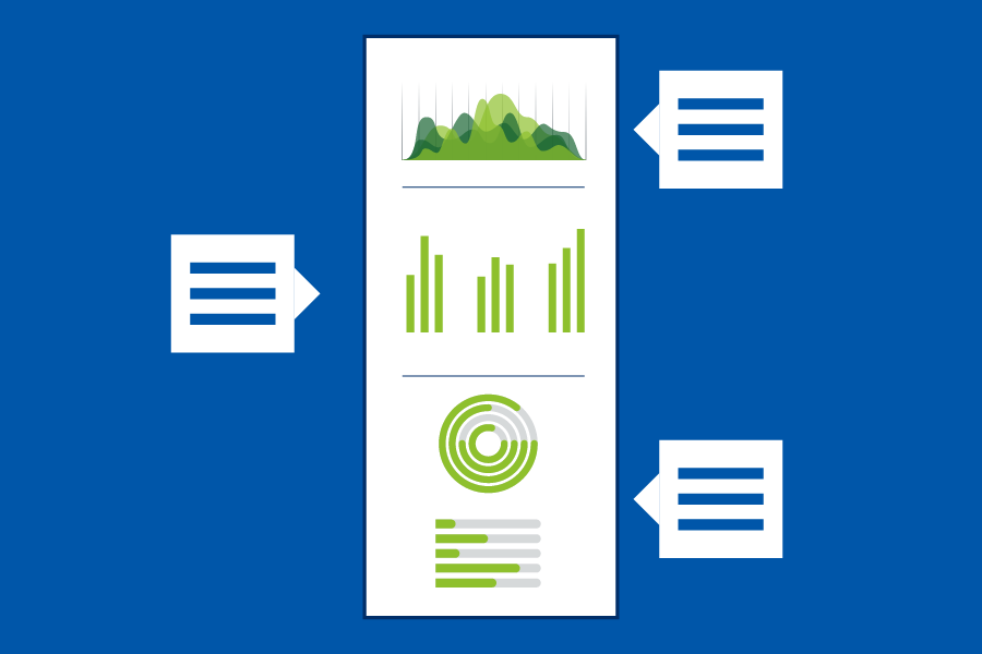
An infographic is typically a static visual representation of specific data, individual data points, or facts about the data.

Data visualizations
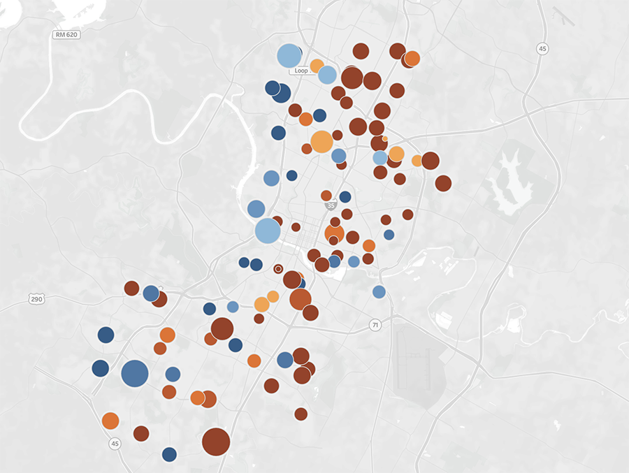
A data visualization can draw data from multiple data sources and dynamically change based on user controls.

Dashboards
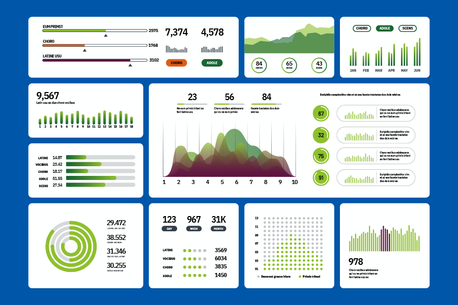
A dashboard brings together multiple data visualizations to give you a comprehensive overview of your data in one place. It helps users monitor and understand different aspects of your data quickly.
