Data visualization colors
Data visualization
Color is a great way to focus attention and distinguish elements. These color palettes were created to enhance accessibility, provide consistency, and ensure data visualizations align with TxDOT's brand. Creators of data visualizations are responsible for ensuring applicable accessibility and brand guidelines are followed.
Best practices
- Text and interactive elements should have a color contrast ratio of at least 4.5:1.
- Color must not be the only indicator for interactive or informational elements.
- Red/green color blindness is common, so avoid green and red colors alone to indicate status.
Adding colors in Tableau
Follow the steps below to add any of the color palettes (below) into the Tableau desktop application.
- On your computer, go to C:\Users\[Your Username]\Documents\My Tableau Repository
- You should see a file called Preferences.tps. If you have never modified this file before, you can update the file with the content below or replace it. (Employees can download the preferences file from TxDOT's intranet). It contains the code for the TxDOT color palettes. Then when you open (or reopen) Tableau, the color palettes will appear.
- If you already have custom code in your Preferences.tps file that you don't want to overwrite, follow the steps below:
- Open Preferences.tps with Notepad.
- Paste the following code into the file, between <workbook><preferences> and </preferences></workbook>.
Data visualization resources
Use of data visualization colors in other media is prohibited. Data visualizations created in applications other than Tableau must follow TxDOT's brand color guidelines.
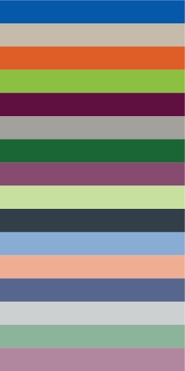
Categorical color palette
These colors communicate differences in categorical data.
<color-palette name="TxDOT Categorical-1" type="regular">
<color>#0658a8</color>
<color>#c5bbaa</color>
<color>#df5d26</color>
<color>#8cc040</color>
<color>#5f0f40</color>
<color>#a3a19b</color>
<color>#1a6634</color>
<color>#884b70</color>
<color>#c7e0a0</color>
<color>#323f48</color>
<color>#89acd4</color>
<color>#efae93</color>
<color>#57668d</color>
<color>#cdd0d1</color>
<color>#8cb49b</color>
<color>#b187a0</color>
</color-palette>

Diverging color palette 1
These colors highlight variations in data values, emphasizing the midpoint and showing how values diverge from it.
<color-palette name="TxDOT Diverging-1" type="ordered-diverging">
<color>#0658a8</color>
<color>#6e80b4</color>
<color>#abaac0</color>
<color>#e2d8c9</color>
<color>#efae93</color>
<color>#e8845c</color>
<color>#e05d26</color>
</color-palette>

Diverging color palette 2
These colors highlight variations in data values, emphasizing the midpoint and showing how values diverge from it.
<color-palette name="TxDOT Diverging-2" type="ordered-diverging">
<color>#0658a8</color>
<color>#6e80b4</color>
<color>#abaac0</color>
<color>#e2d8c9</color>
<color>#b79499</color>
<color>#8c556b</color>
<color>#5f0f40</color>
</color-palette>

Sequential blue
These colors represent a progression of data values, moving from low to high, to illustrate the intensity or magnitude of the data.
<color-palette name="TxDOT Sequential-Blue" type="ordered-sequential">
<color>#0658a8</color>
<color>#2a68b1</color>
<color>#417ab9</color>
<color>#598ac1</color>
<color>#719bcb</color>
<color>#89acd4</color>
<color>#a0bcdb</color>
<color>#b8cde4</color>
</color-palette>

Sequential purple
These colors represent a progression of data values, moving from low to high, to illustrate the intensity or magnitude of the data.
<color-palette name="TxDOT Sequential-Purple" type="ordered-sequential">
<color>#5f0f40</color>
<color>#702754</color>
<color>#7f3f66</color>
<color>#8f577a</color>
<color>#9f6f8c</color>
<color>#b187a0</color>
<color>#bfa0b3</color>
<color>#ceb7c6</color>
</color-palette>
