Design accessibility checklist
Brand Guidelines
This checklist highlights design accessibility considerations. It helps ensure content is accessible and can be used for print, digital, signage, presentations, etc.
This checklist is a practical tool for employees and contractors to use when preparing content. Following these checks helps ensure your work is both on-brand and accessible.
Important: This checklist is intentionally high-level. If your final output falls under specific document or digital accessibility requirements, those requirements take precedence of this checklist.
Color and contrast
- Use sufficient color contrast between text and background.
- 4.5:1 color contrast between text and background colors
- 3:1 contrast between graphic elements and background colors
- Don’t rely on color alone to convey meaning.
- Example: Use icons or labels in addition to colors.
- Avoid problematic color combinations
- Example: Red/green or blue/purple are hard for some users to differentiate between colors.
Content and language
- Use plain language and avoid jargon when possible.
- Example: Say “use” instead of “utilize.”
- Keep sentences short and direct.
- Aim for a reading level around 8th grade.
- Use headings and bullet points to break up dense content.
- Improves scanning and comprehension.
- Use clear headings and labels for content sections and forms.
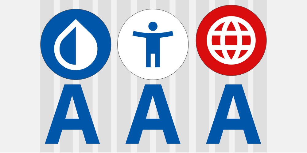
Images and icons
- Use icons that are generally associated with content labels when possible.
- Example: A trash can icon with the word “Delete.”
- Avoid text embedded in images.
- Text in images isn't automatically read by screen readers.
- Ensure imagery supports the message and doesn’t distract or confuse.
- Images should be related to the content.
- Use alt text to describe images that are relevant to content.
Layout and spacing
- Use clear visual hierarchy to guide the user.
- It's better to have long well-structured content than short hard-to-read content.
- Ensure adequate spacing between elements.
- Avoid clutter that overwhelms or confuses.
- Align content consistently to support scanning and comprehension.
- Example: Left-aligned text is easier to read than center-aligned.
Motion and animation
- Avoid flashing or strobing effects.
- Reference: WCAG – Three flashes or below threshold.
- Provide reduced motion options for digital materials.
- Example: Respect system settings for reduced motion.
- Use animation purposefully, not decoratively.
- Example: Use transitions to guide attention, not just for flair.
Typography/Fonts
- Use a minimum font sizes that adhere to accessibility requirements.
- 12-point font in print and 16-pixel for digital content.
- Example: Small text in 8-pixel font is not readable.
- Use headlines sizes to create a clear hierarchy, applied in a consistent and logical order, to guide user and meet accessibility requirements.
- Maintain sufficient line spacing
- Font size 1.5 times line height is a general standard.
- This approach improves readability, especially for users with visual disabilities.
Brand review
- Use brand review checklist.
- Important: Content should follow brand guidelines to build trust, transparency, and consistency.