Column layout control
Component library
How to use this component
Column layout controldivides the page into sections using a 12-column grid, allowing authors to place components side-by-side and ensure they scale responsively across devices.
Use the Column Layout component to organize content side-by-side.
Column options
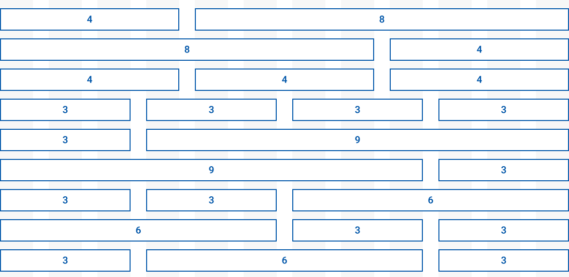
There are 12 column control options where the numbers always add up to 12. The bigger the number, the more space allocated to that section.
For example, with an 4-8 column setup, the left side has less space than the right side.
All options
Column layout options on a 12-part grid include: 4-8; 8-4; 4-4-4; 3-3-3-3; 3-9, 9-3; 3-3-6; 6-3-3; 3-6-3
Best practices
- Follow column setups for specific types of pages.
- Ensure all content fits within the 12-column grid.
- Test for responsiveness across mobile and desktop.
- Don't leave columns blank – every column should contain content.
- Avoid overly specific page layouts, as they may not look the same on different devices and screen sizes.
Placement
- Column Layout Control supports nearly all AEM components.
- Space will be limited in comparison to a full-width page.
- Select the best layout for your content. If content wraps or distributes unevenly between columns, consider a different layout.
Examples
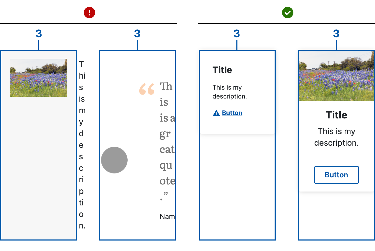
3-3-3-3 Column layout
Bad example:
The media component and quote component are too wide for this layout.
Good example:
The info card and vertical card components fit nicely in this layout.
6-6 Column layout
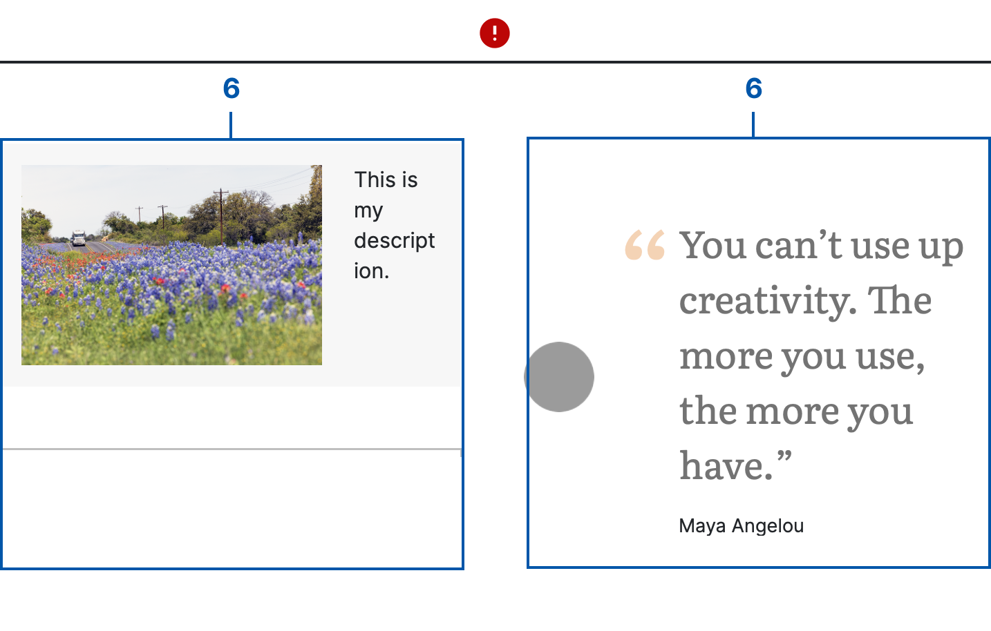
Bad example:
The media object and quote components are too wide for this layout.
8-4 Column layout
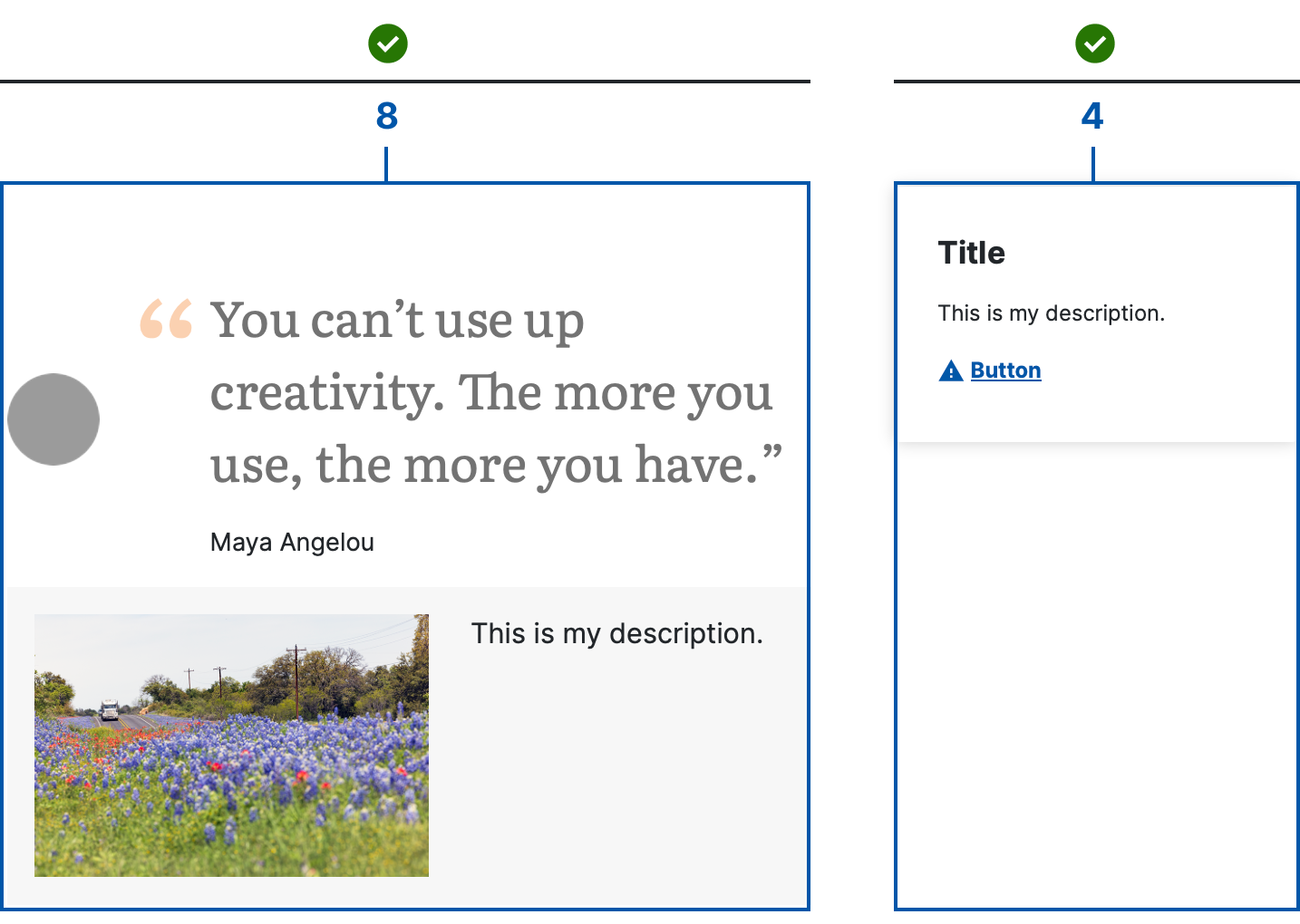
Good example:
The media object and quote components fit best in an 8-column section or larger.
Common layouts
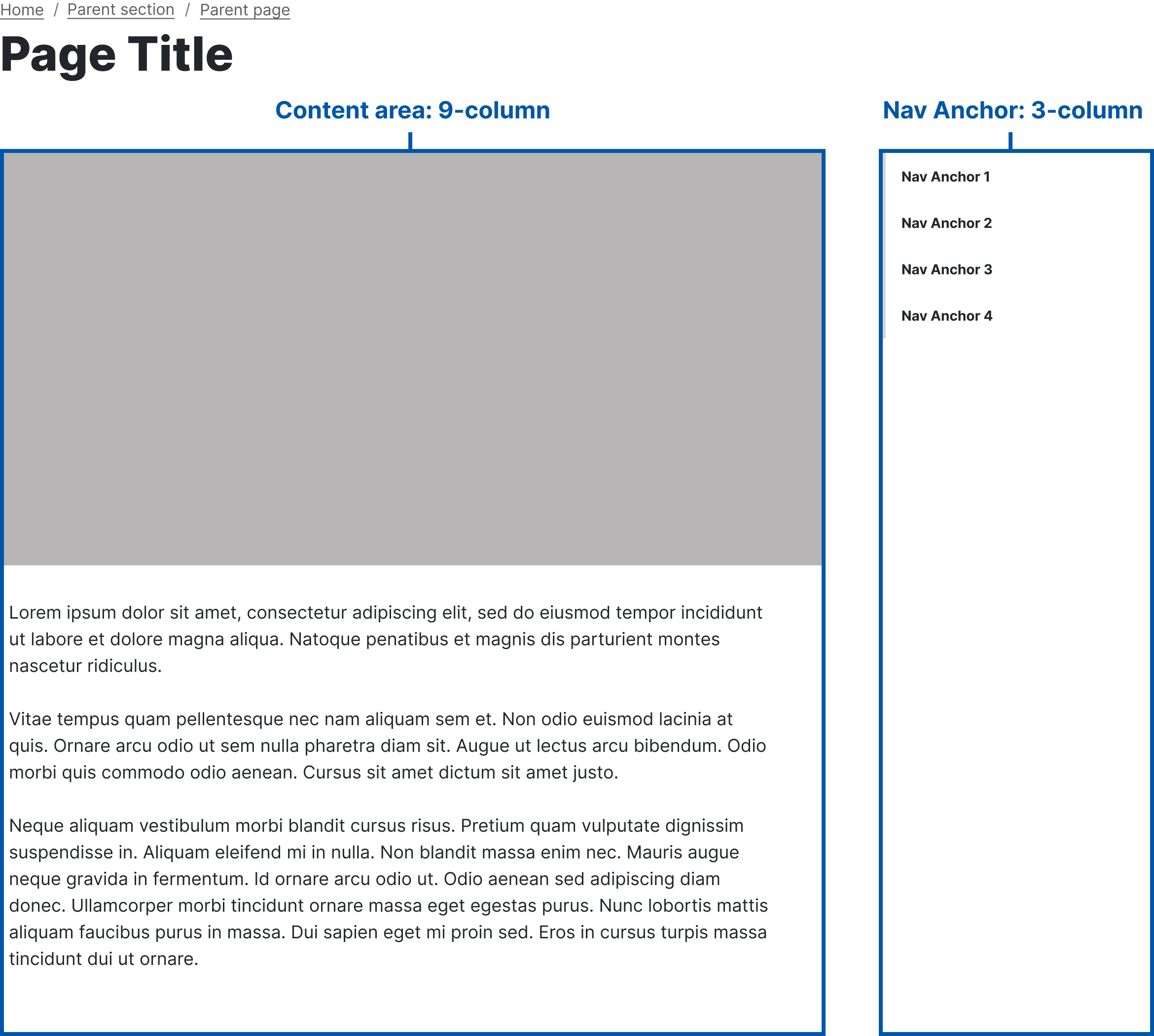
Child page with Navigation Anchor
9-3 Column layout
Pages using the Navigation Anchor component to link to specific positions within the same page should use the 9-3 layout, with anchor links in the right column.
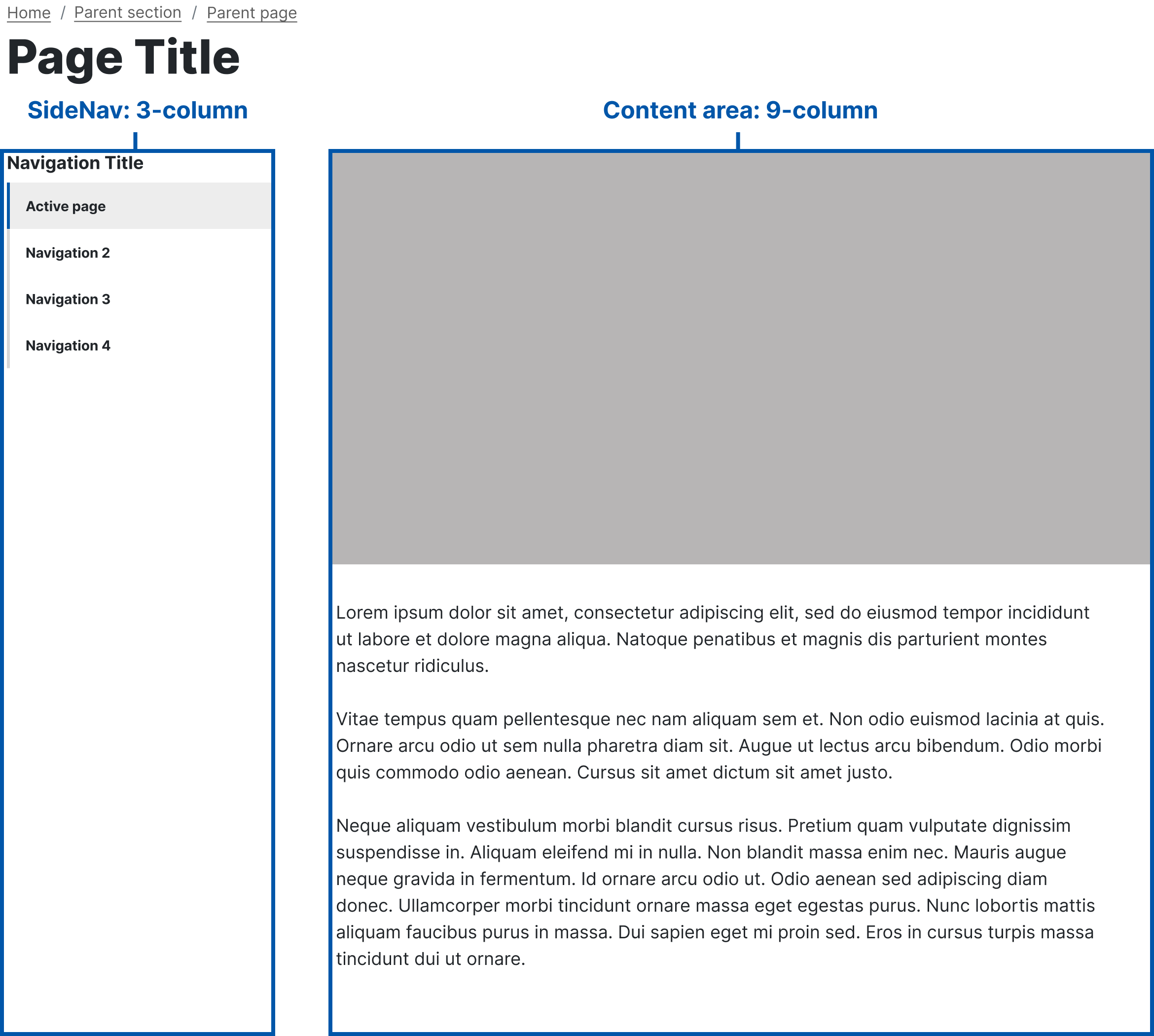
Child page with SideNav
3-9 Column layout
Pages using the SideNav component for navigation to sibling pages should use 3-9 layout, with links to other pages in the left column.
Web coordinator checklist
- Double check columns across multiple devices and screen sizes.
- Use established patterns from the primary, secondary, and child page templates.