Featured content
Component library
How to use this component
The Featured Content component is used to highlight important or distinctive elements on a webpage, directing attention to specific links, whether they are internal or external.
Use this component to highlight content with text, an image, and a button.
Featured content anatomy
- Title
- Border
- Description
- Button
- Background color
- Image

Best practices
The Featured Content component is designed to draw attention to unique or important aspects of a webpage. Not every page needs a Featured Content component.
- Include an image
Use an image to enhance visual appeal and engagement.
- Keep descriptions concise
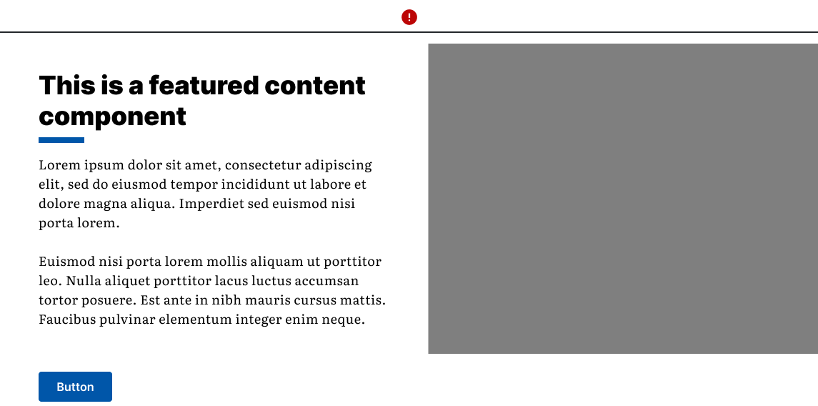
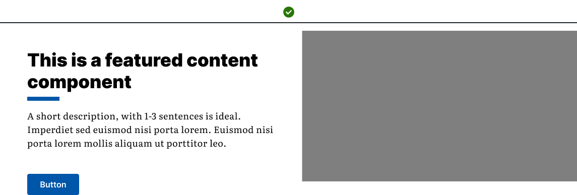
Provide context with description text, but keep it brief and to the point. Aim for 1-3 sentences.
- Use all fields
Include a button, image, title, and short description.
- Avoid long paragraphs
Keep descriptions short and to the point. Use a text component if more detailed information is needed.
- Don’t overuse
Using multiple Featured Content items on a single page can pull focus in too many directions.
Bad example: The description is too long.

Good example: Follows best practice guidelines.

Placement
The Featured Content component includes the following fields:
- image
- title
- description
- button
- anchor ID
- background color (white or blue)
If you don’t need most fields, consider a different component.
Options
Background color:
- White: White background with black text.
- Blue: Blue background with white text.
Image position:
- Left: Image on the left, text on the right.
- Right: Image on the right, text on the left.
Example: White background, image position left

Example: Blue background, image position right

Web Coordinator Checklist
Button
- Button text must be descriptive. Avoid vague text like "Read more" to ensure accessibility.
- Ensure you add a link to make the button appear.
- Use the checkbox for opening external links in a new tab.
Description
- The description should introduce visitors to information, not contain all the content.
- Aim for 1-3 sentences. Use additional text components for detailed content.
- The description can include hyperlinks, bullets, and styles. However, the default style is preferred.
Break up multiple components
If more than one Featured Content component is necessary:
- Visually separate them with text blocks or headings.
- Alternate between left- and right-aligned.
Images
- Only use images that are uploaded and published in the Digital Asset Manager (DAM) within AEM.
- Ensure that the correct metadata is included for all images.
- If an image is purely decorative and doesn't need to be read by assistive technologies, select the checkbox to mark it as decorative.
- Try to avoid placing text on images. If it is unavoidable, ensure the text or important details have sufficient color contrast to be distinguishable by users with visual impairments.
- If needed, you can override the default alternative text from the DAM. To do this, select the "Override Text from DAM" option and enter your desired text.
Anchor IDs
- If using an Anchor ID, ensure it matches the ID in the Navigation Anchor component.
By following these guidelines, you can effectively use the Featured Content component to enhance the visual hierarchy and user experience on your pages.