Vertical Card
Component library
How to use this component
Vertical Cards present related information in a compact, visually appealing format, making it easy for users to browse and access content. They provide a brief summary of content, often with a link to more details, and are typically displayed alongside other cards to group related content.
Visually highlights and links to other content, featuring an image or icon and a brief description.
Vertical Card anatomy
- Cards per row: 1-5 available
- Border style: Raised, flat or icon
- Image: PNG or SVG supported
- Title
- Description
- Button
- Row gap: Space between each row for cards spanning multiple rows

Best practices
- Use consistent image sizes, ensuring uniform aspect ratios.
- Provide essential, summarized information.
- Use consistent elements across cards in a group.
- Use SVG icons with the Icon style card, instead of photography.
- Avoid displaying more elements per row than the actual number of cards.
- Don't mix different types of content across cards in the same set.
- Don't overwhelm the card with excessive content.
Examples
Bad example:
- Inconsistent image sizes
Issue: Images vary in size, leading to uneven visual presentation.
Recommendation: Use consistent aspect ratios for images (preferably 900x600 pixels). - Inconsistent card elements
Issue: Some cards have descriptions, titles, or buttons while others do not.
Recommendation: Ensure consistency across cards. If one card includes a description, title, and a call-to-action button or link, then ensure all cards include these elements. - Inconsistent button text length
Issue: Button text varies significantly, causing inconsistent formatting.
Recommendation: Maintain similar button text lengths across cards to avoid poor formatting.

Good example: Uses consistent image sizes and elements, following best practice guidelines.

Vertical Card types

Raised
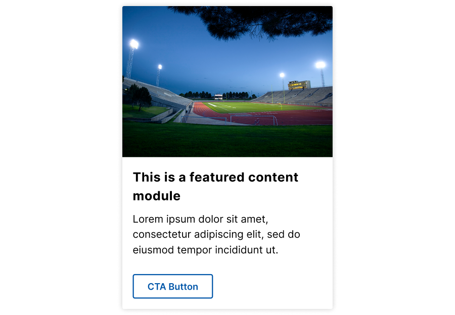
Features a drop shadow border and a secondary button.

Flat
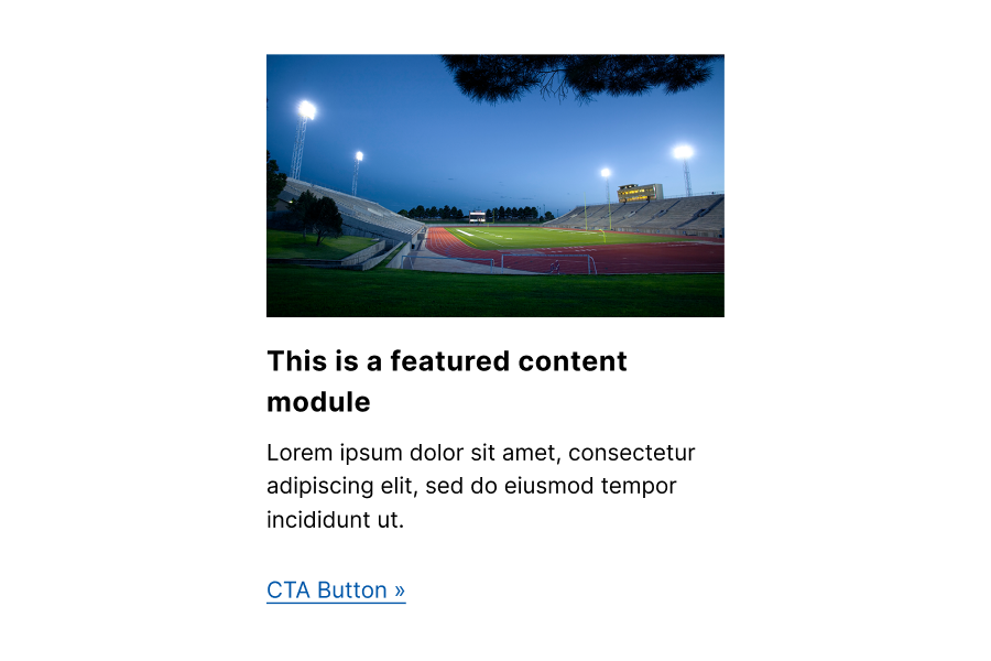
No border and uses a tertiary button as a call to action.

Icon
Displays an icon, like an SVG, to illustrate the content. The entire card is clickable, and a background appears when hovered over.
Placement
- Place Vertical Cards in wide, main content areas, with high-priority items near the top.
- Adjust the number of cards per row from one to five, depending on the content area width.
Accessibility guidelines
- Ensure all images have appropriate alt text, unless the image adds no additional information to the content on the page, then mark as decorative.
- Use clear, descriptive button text (avoid phrases like "Click here" or "Read more").
- Each button should have a unique label.
- When linking to external content, set links to open in a new window to inform users.
| Keys | Action |
| Tab | Navigates to the next actionable element |
| Space/enter | Triggers the button or link |
Web Coordinator checklist
Determine content:
- Decide the number of cards needed (up to five per row).
- Ensure each card has an image or icon, description, and optionally a title and button text/link.
Style selection:
- Choose a border style: Raised, flat, or icon.
- Set the bottom margin and row gap for spacing.
Image consistency:
- Use images with the same size and aspect ratio.
- Check the decorative image checkbox for non-informative images.
Link configuration:
- Include button text and links where needed.
- Ensure external links open in a new window.
Content uniformity:
- Maintain consistency across all cards in terms of included elements (e.g., all have descriptions if one does).