Image
Component library
How to use this component
Images are powerful tools that support storytelling and should always relate to the accompanying text. Use the Image component to add context, draw attention, or visually represent your information.
Add and configure images to enhance visual storytelling and content.
Image specifications
Prepare images with these specifications before loading them into the Digital Asset Manager (DAM).
Supported file types:
- PNG (72 PPI resolution)
- SVG
Other formats are not supported, including JPG
Unsupported
JPG, BMP, TIFF, PDF, etc.
File naming conventions:
- All lowercase
- No spaces
- Use hyphens to separate words
- Use keywords for SEO and DAM discoverability, avoid generic terms
Bad image name
Image004321.png
Alt text metadata required fields:
- Document title
- Description
See accessibility section below for additional guidelines.
Supported image sizes:
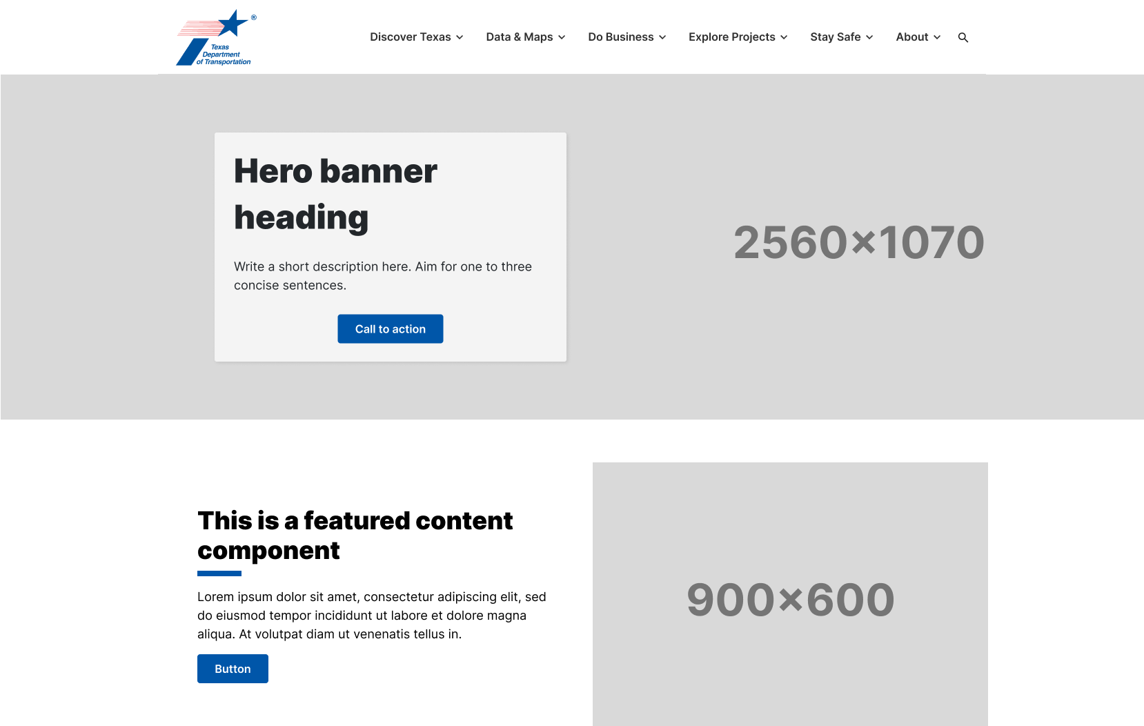
- Tier 1 webpage banner: 2560x1070px
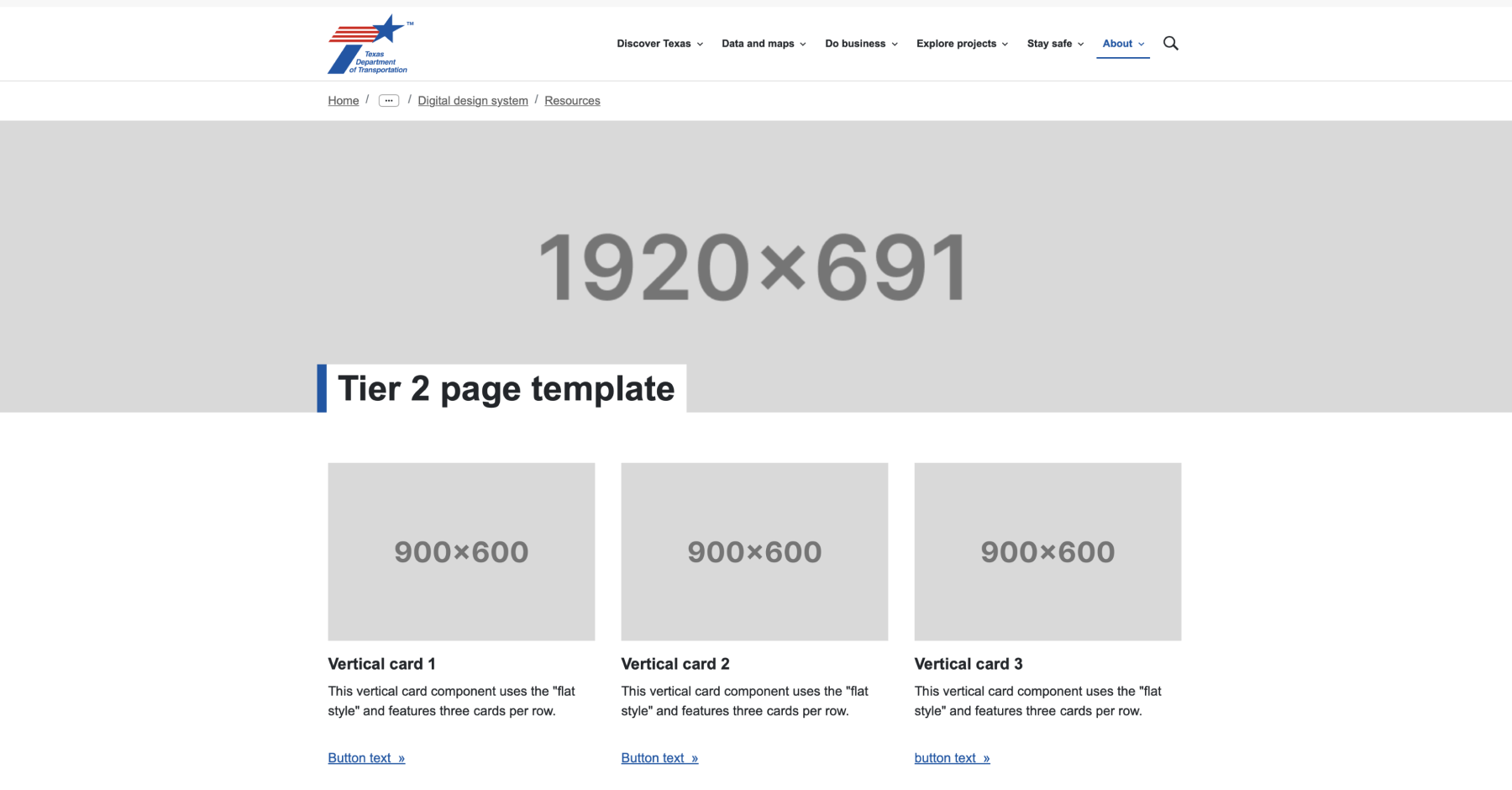
- Tier 2 webpage banner: 1920x921px
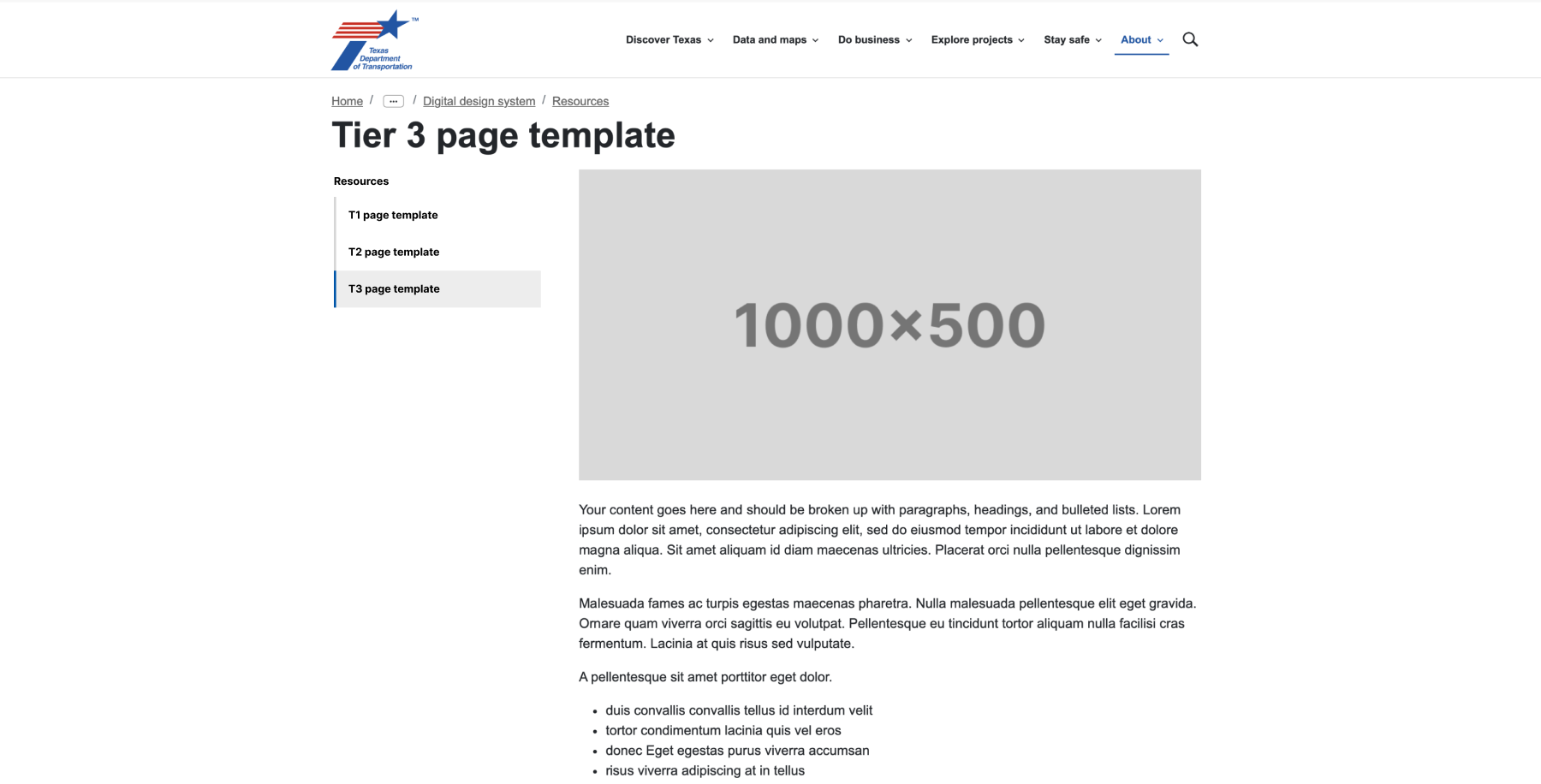
- Tier 3 webpage banner: 1000x500px
- Pull quote images: 900x900px
- Landscape images: 900x600px
Used for: vertical card component, featured content component - Leadership portraits: 600x750px
Image size examples
Tier one sample page

Tier two sample page

Tier three sample page

Best practices
Consider the visual impact and accessibility for audiences when adding images.
- Use appropriate image specifications and sizing.
- Provide adequate spacing around images.
- Use alt text or mark the image as decorative, if applicable.
- Use the "Configure" option when editing rather than the "Edit" function.
- Avoid text-heavy images when possible.
- Avoid pixelated, low-quality images.
- Don't wrap text around images; maintain responsive design principles.
- Don't use AEM to crop images.
Placement and configuration
- Images will attempt to resize to the content area they are placed in.
- Decorative images are typically displayed at the top of pages.
- Informative images can be distributed within the body of the page.
Image Characteristics
- Usage: Images on TxDOT.gov can only be used if they have been uploaded and published to the Digital Asset Manager (DAM).
- Alternative text: Images must have descriptive alternative text to assist visually impaired readers.
Image layout properties
- Lightbox: Opens the image in a modal window with a 900x600px size, overlaying the current page.
- New tab: Opens the image in a new browser tab when clicked.
- Not clickable: Makes the image non-interactable.
Image Content
- Decorative Images: If "Image is decorative" is selected, the image will be ignored by assistive technology and won't require alt text.
- Caption: A caption can be provided if desired. Ensure it is concise and either describes the image or provides a call to action (e.g., "click to view a larger image").
- Link: An optional link can be attached to the image. If used, it directs the user to another resource within TxDOT.gov or an external site.
- Internal Links: Use the "Open Selection Dialog" option to the right of the URL field and navigate to the desired page.
- External Links: Check the "Open in New Window" box if the image links to an external site.
Accessibility
Metadata description:
- Use descriptive alternative text for images to assist visually impaired readers, unless the image adds no additional information to the content on the page, then mark as decorative.
- Mark decorative images appropriately in the Metadata tab so they are ignored by assistive technology.
- Avoid redundant phrases like "image of" or "picture of" as screen readers already indicate the presence of an image.
- Provide relevant information that enhances the understanding of the content.
- Aim for alternative text to be no more than 125 characters.
Metadata title:
- Ensure the title adds value and does not repeat the description.
- Keep the title concise and informative.
- Remember, the title attribute appears as a tooltip when a user hovers over an image.
Color contrast:
- Try to avoid text on images, however if this is unavoidable, ensure that images with text or important details have sufficient color contrast to be distinguishable by users with visual impairments.
Scalable images:
Use SVGs for icons and simple graphics because they scale without losing quality and are accessible to screen readers when properly implemented.
Web coordinator checklist
- Prepare images according to specifications and save them in PNG or SVG format at the appropriate DPI and dimensions.
- Add and verify alt text metadata for each image.
- Save images using the specified naming convention.
- Upload images to the Digital Asset Manager (DAM).
- Place the image in the appropriate content area.
- Configure the image settings (e.g., lightbox, new tab, non-clickable) as needed.
- Mark the image as decorative if it does not convey additional information.
- Provide a caption if necessary, ensuring it is concise and descriptive.
- Add a link to the image if required, ensuring proper configuration for internal or external navigation.